Emotional Wellness Home Screen
PURPOSE
An emotional wellness app that helps users recognize their emotions and provide them with quick resources. The app supplies users with simple tools they can use to overcome day to day emotional demands. There are different methods presented in the app to help users find various avenues of dealing with their day to day demands.
PROCESS
I completed the UX design process which includes three key components.
1. Conducting user research – Developing personas, scenarios, use cases, and app criteria
2. Design - Research, sketching, wire-framing, interactive prototype, and refinements
3. User Research – Usability study plans, usability studies, qualitative data analysis
GOALS
Through this project, I wanted to create a meaningful experience for users. The app needed to be simple, easy to use, and contain helpful tools. I accomplished this by conducting user research and usability studies. I discovered there are a variety of ways to deal with stresses and this app needed to provide users with multiple methods for dealing with stress. I aimed to incorporate their needs as much as I could during the design process.
TARGET AUDIENCE
The target audience was male and females ages 18-35 living in the United States. These individuals deal with mild-medium emotional demands and want to find a way handle them correctly. Many don’t understand what emotions they are dealing with and need simple solutions for then to find peace in their life. They have the opportunity to seek professional assistance, but desire to try some “at-home” solutions first.
USABILITY TESTING
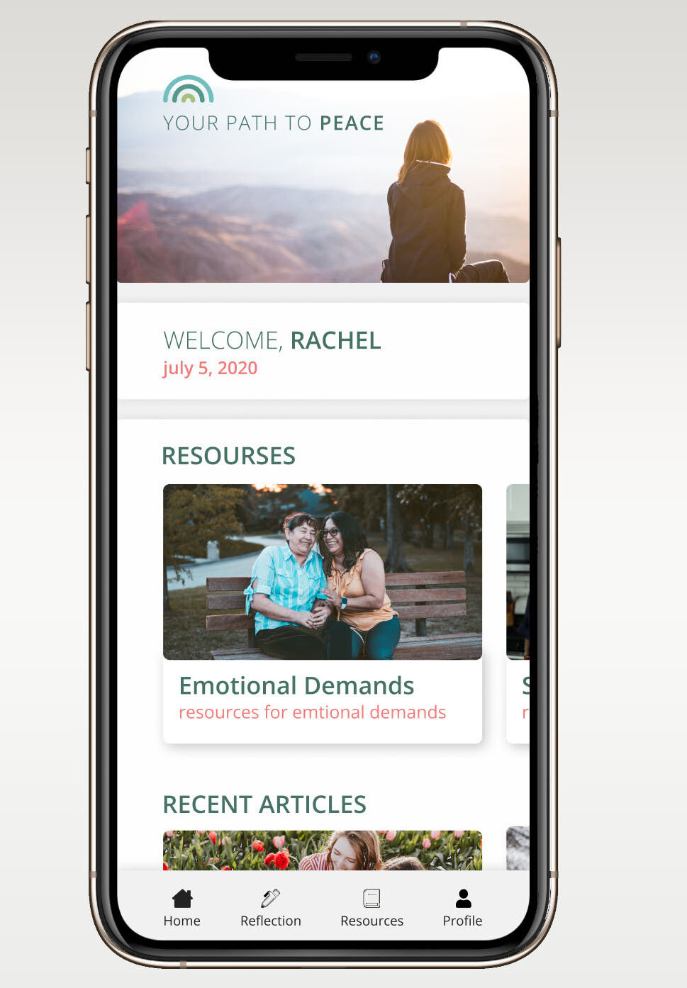
For quite a while, I wasn’t able to get the home screen “just right”. I continued to get feedback saying my home screen was confusing or it didn’t communicate the main purpose of the app. I learned that my users wanted more intuitive and simple designs. Each time I received feedback, I evaluated the design and I made the necessary adjustments. By involving users in each stage, my goal has been accomplished to created meaningful experiences for users.
KEY LEARNINGS
This project allowed me to collaborate with users in order to understand their needs. I learned how critical users are to the UX design process. They provide valuable feedback on what isn’t working, what is confusing, or what could be easier. I also learned how to solve problems.
Link to full interactive mockup

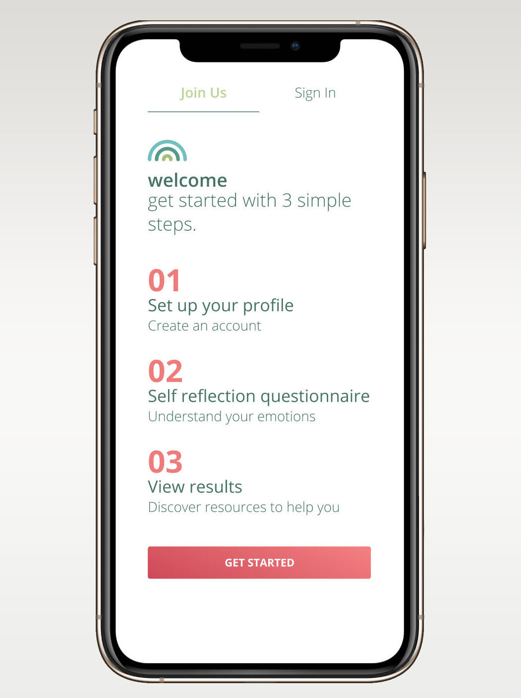
Sign In Screen

Home Screen

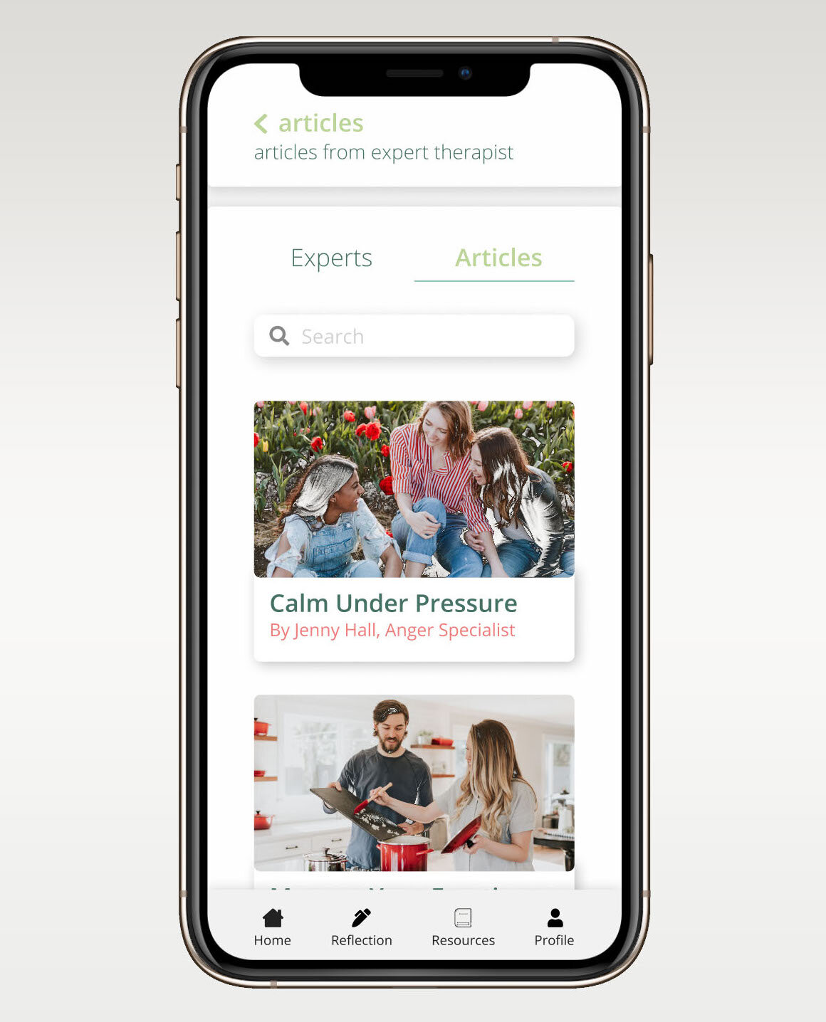
Expert Articles Screen
